

print design: magazine layout
The subject matter for this article wasn’t exactly my cup of tea, but I think the final design came out beautifully! The audience for this particular article includes anyone with an interest in space exploration, the planets, or the idea of life on other planets. To be effective, the layout needed to be balanced, provide visual interest with images as well as typography, and the text needed to be legible and readable, with fonts that paired well with each other as well as with the subject matter. I decided to use two futuristic fonts that complement each other, while still having good contrast. I used different, larger and bolder fonts for the title, callouts and header to create hierarchy. Lastly, I chose a starry background image and took inspiration for the text color from there. I hope you like it as much as I do!
Photo credits:
“Glowing spaceship orbits planet in starry galaxy generated by AI” by Vecstock on Freepik.com. Free to Use. Freepik.com. https://www.freepik.com/free-photo/glowing-spaceship-orbits-planet-starry-galaxy-generated-by-ai_40968198.htm#fromView=search&page=1&position=0&uuid=9eaab71a-b4f7-4d13-ba5f-17bbc9ff6e28.
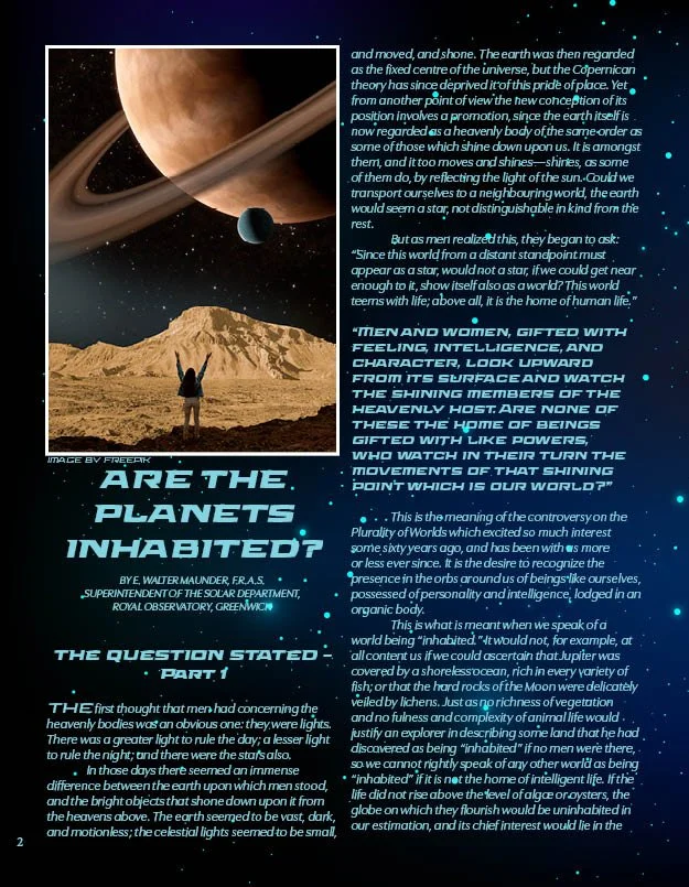
“Space collage with young woman” by Freepik on Freepik.com. Free to Use. https://www.freepik.com/free-photo/space-collage-with-young-woman_19245748.htm#fromView=search&page=6&position=17&uuid=9eaab71a-b4f7-4d13-ba5f-17bbc9ff6e28.
“Starry sky background” designed by Freepik. Freepik.com. Free to Use. https://www.freepik.com/free-vector/starry-sky-background_844325.htm#fromView=search&page=5&position=50&uuid=eeb23776-c0b6-4636-96e2-1f8e1f0d68cd.