
Business card design
Adrienne is starting her own YouTube channel and already had this beautiful logo designed for her by Jada Fitch (jadafitch.com), but she needed a business card and asked me if I could design one for her.
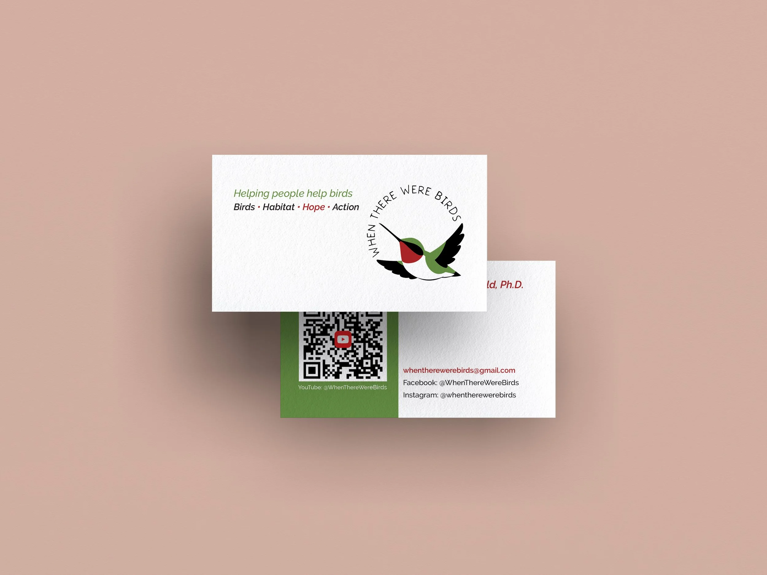
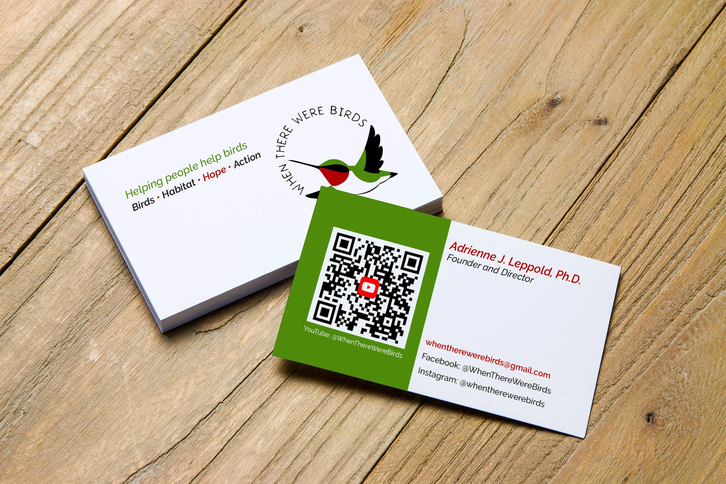
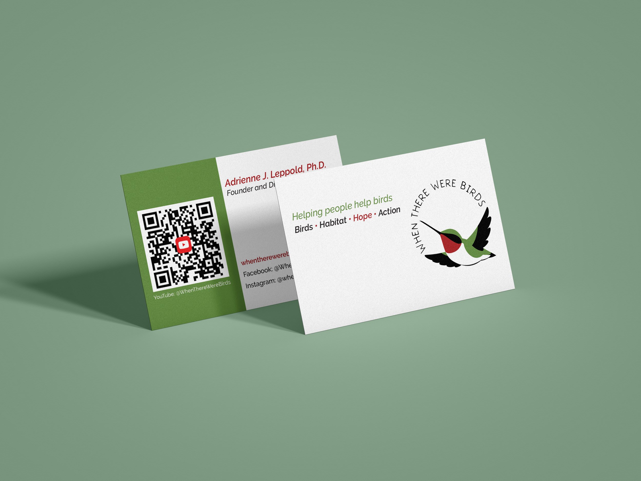
After experimenting with colored backgrounds and trying to fit text without it being too small and difficult to read, I decided to completely change tactics and settled on this design solution. The white background on the front allows the logo to shine. By placing the logo on the right, I could then place Adrienne’s taglines on the upper left, so the bird’s bill is pointing to the text. The placement of both elements draws your eye right to the intersection of both features. I used colors from the logo for the taglines, using the red to help the word “Hope” stand out from the rest.
On the back, the green background taken from the logo color really helps the QR code for Adrienne’s YouTube channel to pop. The contrasting white background then draws your eye, and the red text draws it immediately to Adrienne’s name at the top and then to her email. The use of colors from the logo throughout helps to maintain a consistent look and feel to the business card and ties all the elements together nicely.
Please check out Adrienne’s channel on YouTube (launching in April 2026 @WhenThereWereBirds) or find her on Facebook (@WhenThereWereBirds) or Instagram (@whentherewerebirds).
Mockup by Graphics Fuel on graphicsfuel.com
Client
The Atlas Project
Year
01/01/0001
Year
01/01/0001
Client
The Echo Project