solstice plus logo redesign
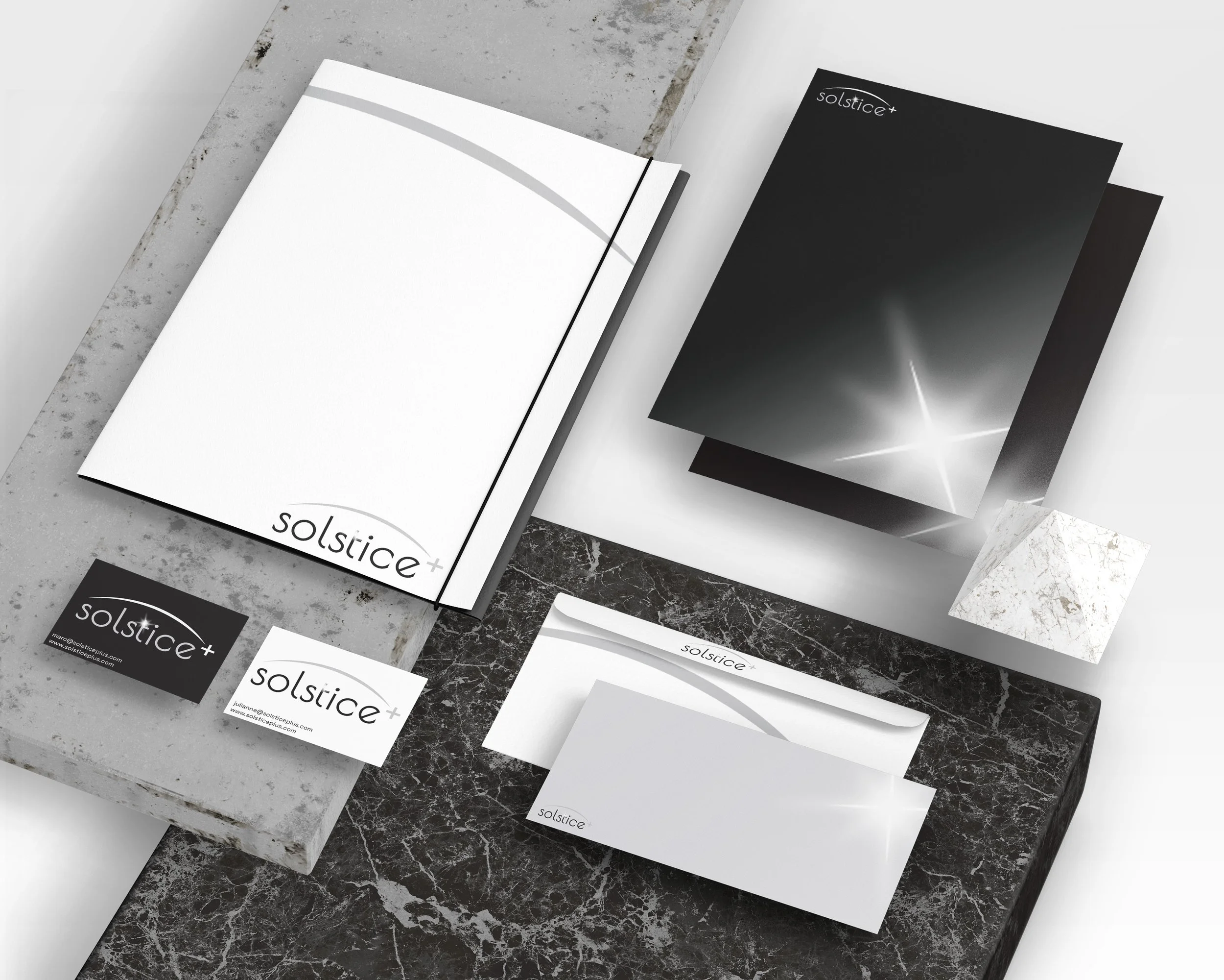
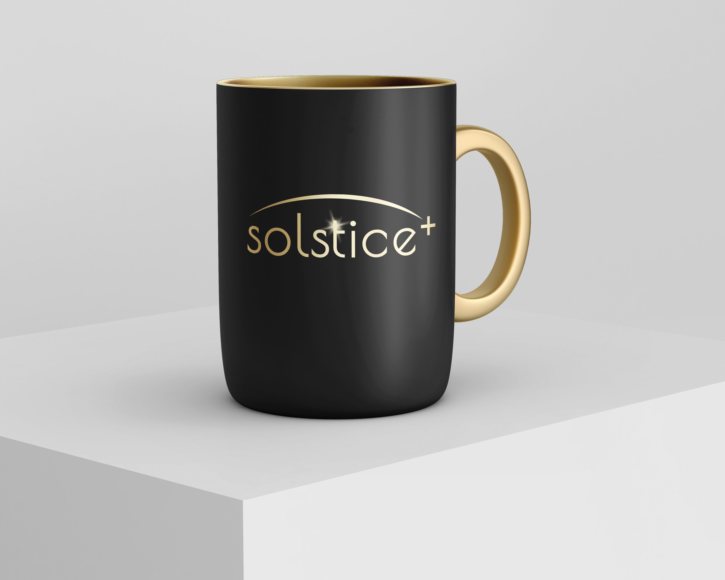
Solstice Plus is a small company located in Quebec that designs human resources and payroll software. They wanted to re-design their logo and website. They were looking for a minimalist style with muted colors, like various shades of gray or black. I presented them with a variety (probably too many) of options for the new logo. The first concept was taken from a solargraph of the sun’s path over a 6 month period. Other concepts explored circular symbols around the business name and variations on the “plus sign”, including some that evoked a star. They ultimately chose this arch and sun flare on the “t” in the company name.
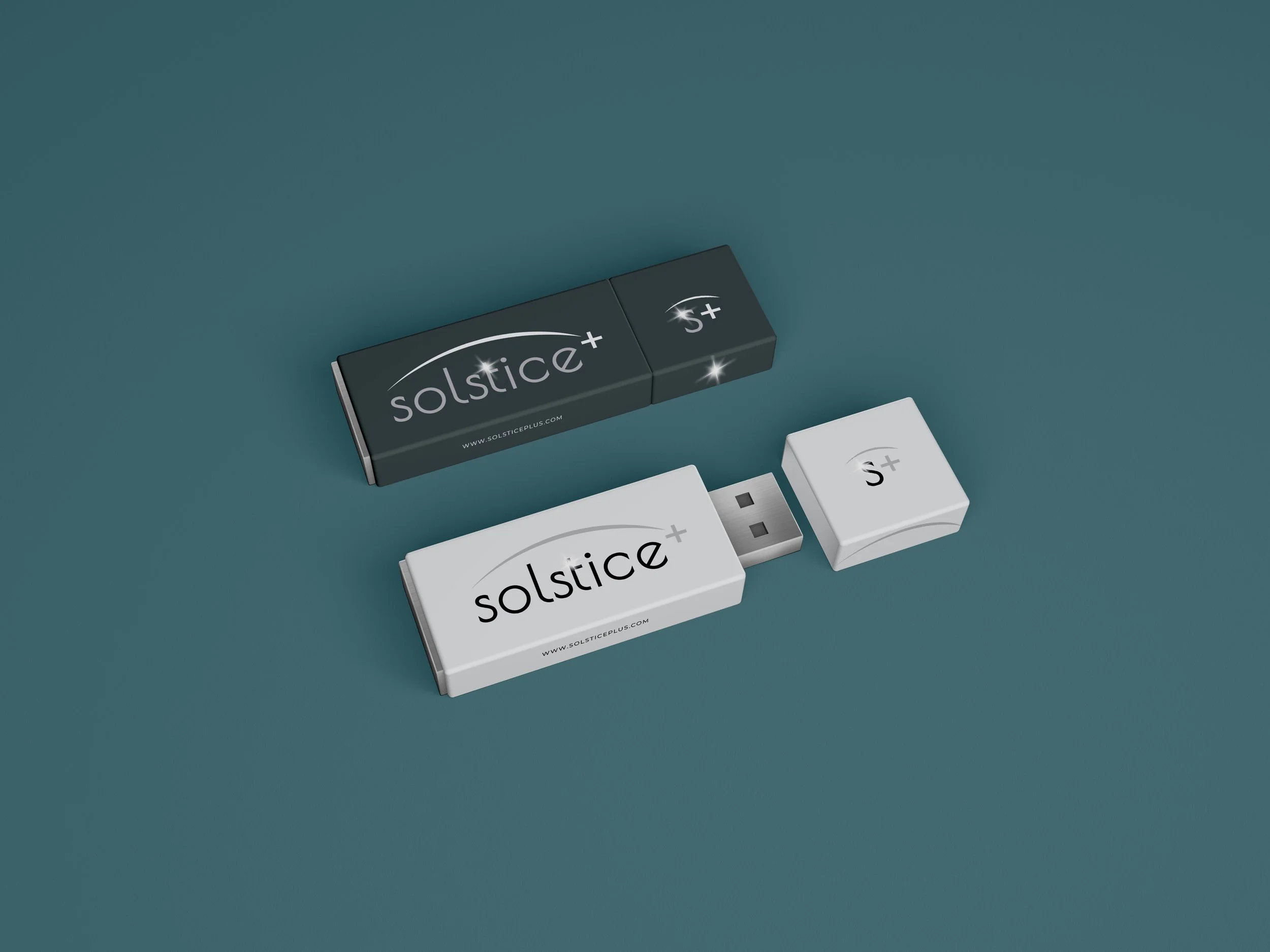
I created several color versions of the logo for use on light or dark backgrounds. I also designed a smaller version with just the “S+” for even more versatility.