
logo design: The coffee guild
guilds bring to mind artisans and quality, which is reflected in this logo
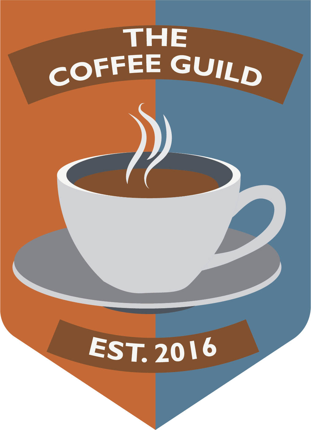
This fictional client was a coffee shop that provides high quality, organic, ground in-house coffee and espresso. They are self-described “coffee snobs” and pride themselves on offering cold brew, single origin coffees. They wanted a seal, or badge style logo and wanted to include not only the business name, but the tagline of “Established 2016”. They want their coffee shop to be a place for people to stay and work and play, so they wanted colors that reflected a calm, chill, relaxed vibe. They wanted to avoid green and black and to stay away from bright, neon colors. They also wanted to appeal to hipsters and millennials (ages 18-39 years old). Lastly, they wanted a coffee bean or coffee element included.

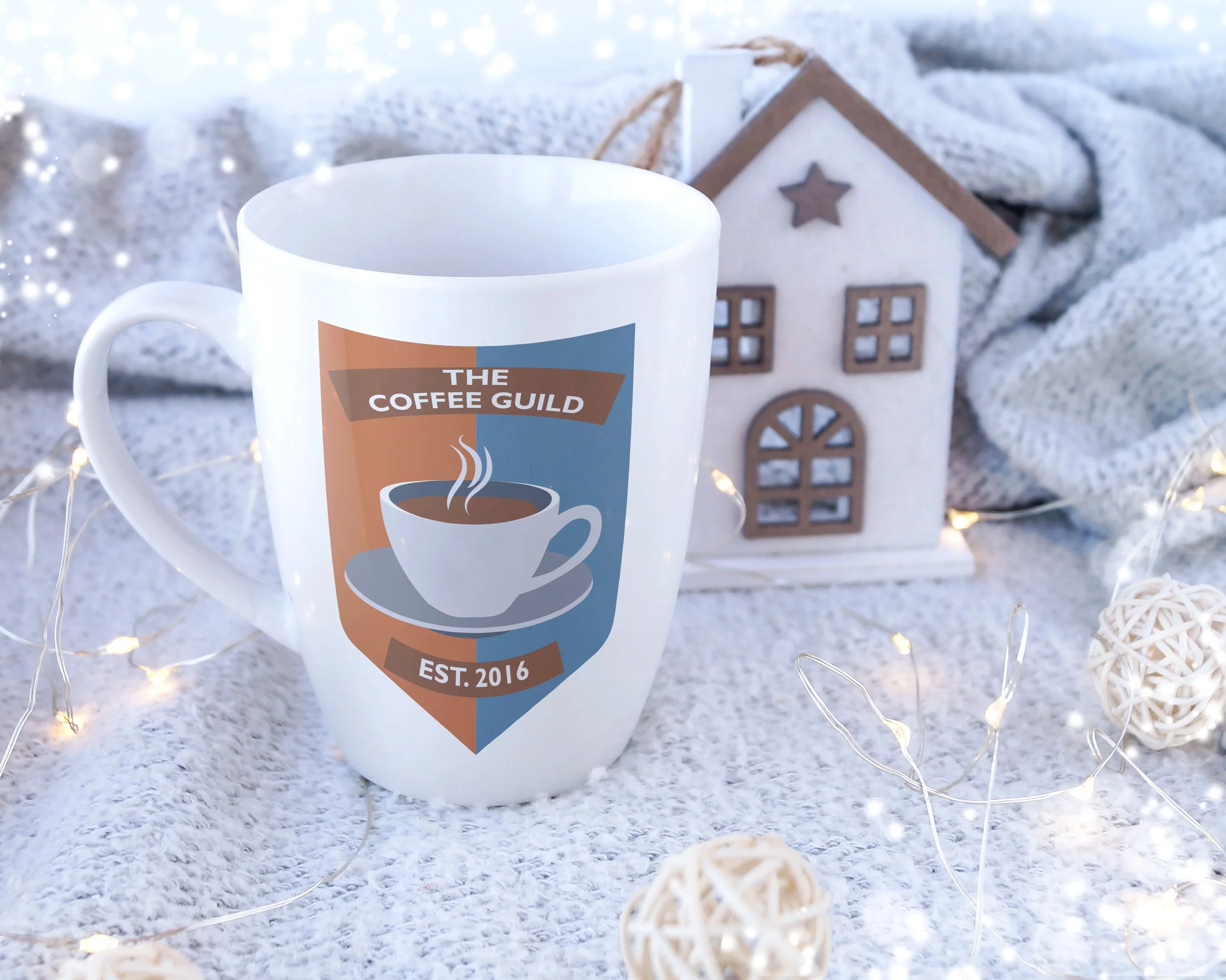
Photo by Freepik on Freepik.com. Free to use with standard license.
The name “The Coffee Guild” made me think of medieval guilds and their fabulous signs that you might see in some European towns to this day (think of the hanging signs with giant shoes for cobblers, or a pretzel for a bakery). I looked for inspiration on the internet and tried to draw something like those signs, with a coffee mug or a coffee bean, but nothing looked quite right. I finally decided to try something like a guild shield, which you also often saw for medieval guilds. I used a sans serif font to appeal to Millennials and decided to use complementary orange and blue colors for the shield in the background to create visual interest, while also conveying a relaxed feeling.